Wiggle's Product Listing Page
Redesign - 2018
Context
We believed there was an opportunity to increase the number of customers who go on to purchase after viewing a listing page.
Business Opportunities
- Funnel customers from PLP to view a PDP or add to cart from listing pages
- Improve visibility of products and key information
- Enhanced/new shopping features
- Support the responsive programme
- Making pages more ‘findable’
- Increase organic traffic

Current Experience
The current product listing page is messy and outdated compared to the rest of the site. Some features on the page are hard for users to use e.g. compare

Assumptions
The Product Listing Page design looks cluttered and overwhelming with the amount of information provided. Users aren’t inspired by the listing page and must click through to the product page to view and add items to the basket. Landing page SEO solutions are ineffective and not customer centric. The page is also not responsive.
The Discovery Phase
Research hypothesis + Questions
- Should we show different content by product type? Page type? Navigation type?
- Larger product images are a better experience?
- Is endless scroll the best experience?
- The role of the PLP is to shop or navigate from?
- The role of the PLP is to validate that the product is for the user? (Content)
- Do customers act upon urgency on PLP?
- PLP should be flexible by journey type? E.g. 'Filters' or 'Scrollers'
Research Approach
Overview of research Undertaken:
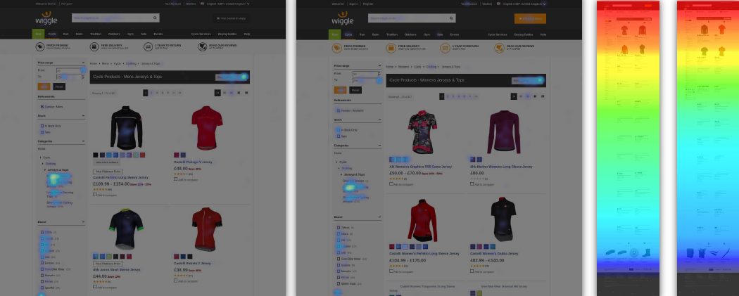
- Hotjar Heatmaps – 9 Heatmaps 18,000 customers
- Hotjar Polls – 2 Polls 81 customers
- What Users Do – 14 tests, 82 participants 10+ hours of recordings
- Workshop – 2 Workshops
- Google Analytics
- Competitor Analysis


Noticeability Test
A research technique I used for learning whether people notice key elements in the designs

Group Competitor Analysis
After completing my own competitor analysis I created a workshop around looking at our competitors and invited staff from all round the business to have their input. The results were extremely valuable.

Areas of opportunity
From the user research and business needs the team broke each opportunity into nine epics.
- A clean & clear listing hierarchy
- Increase Organic content
- Quickbuy
- Filters
- Labelling
- Wishlist
- PLP Recommendations
- Stock urgency and EWIS
- Promotional Content Area
1. A clean & clear listing hierarchy
- As a user I want to be able to view multiple products with clear images at once in a simple and clear list regardless of device.
- As a user I want a simple pricing message
- As a user I want to be able to easily view more products and navigate which products from I am viewing (by page or similar solution)
- As a user I want listing pages to be introduced at the top of the page with relevant information to understand the product range
- As a user I want it to be clear when there are more than one colour/flavour option
2. Increase Organic content
- As a business we want to include content on the listing page to increase organic traffic, without disrupting the customer journey.
3. Quickbuy
- As a business we want to be able to test the value of having a 'quick buy' option that allows customers to add to the basket without viewing a product page.
4. Filters
- As a business we would want to test how filters are served on a listing page to allow customers to browse more easily.
5. Labelling
- As a business I want customer facing messages that create urgency to purchase, where appropriate
- As a business we would like to be able to control when and where messaging appears.
- As a customer I want important information easily visible on a listing page, where appropriate.
6. Wishlist
- As a user I want to be able to add to my wishlist from the listing page
7. PLP Recommendations
- As a user I want to be shown recommendations based on my previous (e.g. consumable) purchases
8. Stock urgency and EWIS
- As a user I want to be shown items which are out of stock on the product listing page
- As a user I want to be notified by email when the item is back in stock
9. Promotional Content Area
- As a business I want customers to view are promotional material while shopping
The Design Phase
Design Studio
We kicked off the Design Phase with a Design Studio. In the past we’ve found this an effective way to produce wireframes in a fast way and so all people from around the business can have their input into the designs earlier rather than later.

UX planning
We worked in a agile way so a plan was drawn up to follow and the team met up everyday for 30 minutes for updates and feedback.
High fidelity Mockups
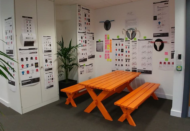
The high fidelity mockups were created in photoshop. Each version of the design or alteration to the design were printed and displayed on the wall for reference. This also let the whole business see our designs and feedback any concerns they had.

Design Session
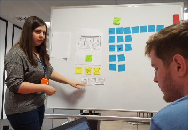
Quick buy later named to Quick view was the most complicated feature on the product listing page. Three designs were drawn up in paper prototypes to show each journey and the behaviour of the quick view to the project team. From this discussion two of the designs were created into high fidelity and when presented back to the team the choice to go with a sliding quick view was decided.

User Testing
At this point we had a working prototype that our UI designer had made and a lot of design changes had happened with addition of the sliding quick view. A small Whatusersdo test was setup to check the design changes made sense to our customers to de risk the project going forward. The results showed the our customers had no issues using the new design and understood the quick view feature
Final Designs
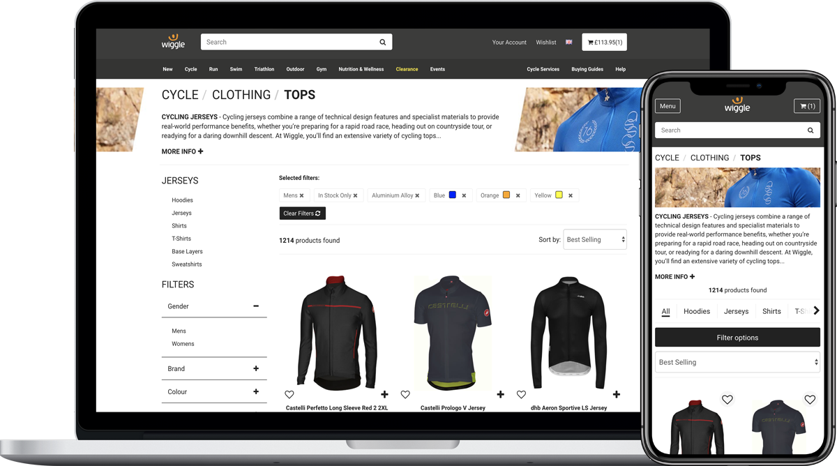
The final flat designs were mocked up and prototype updated ready for development
